Akita Tactical
Identity – Print+Digital – Art Direction
![]()
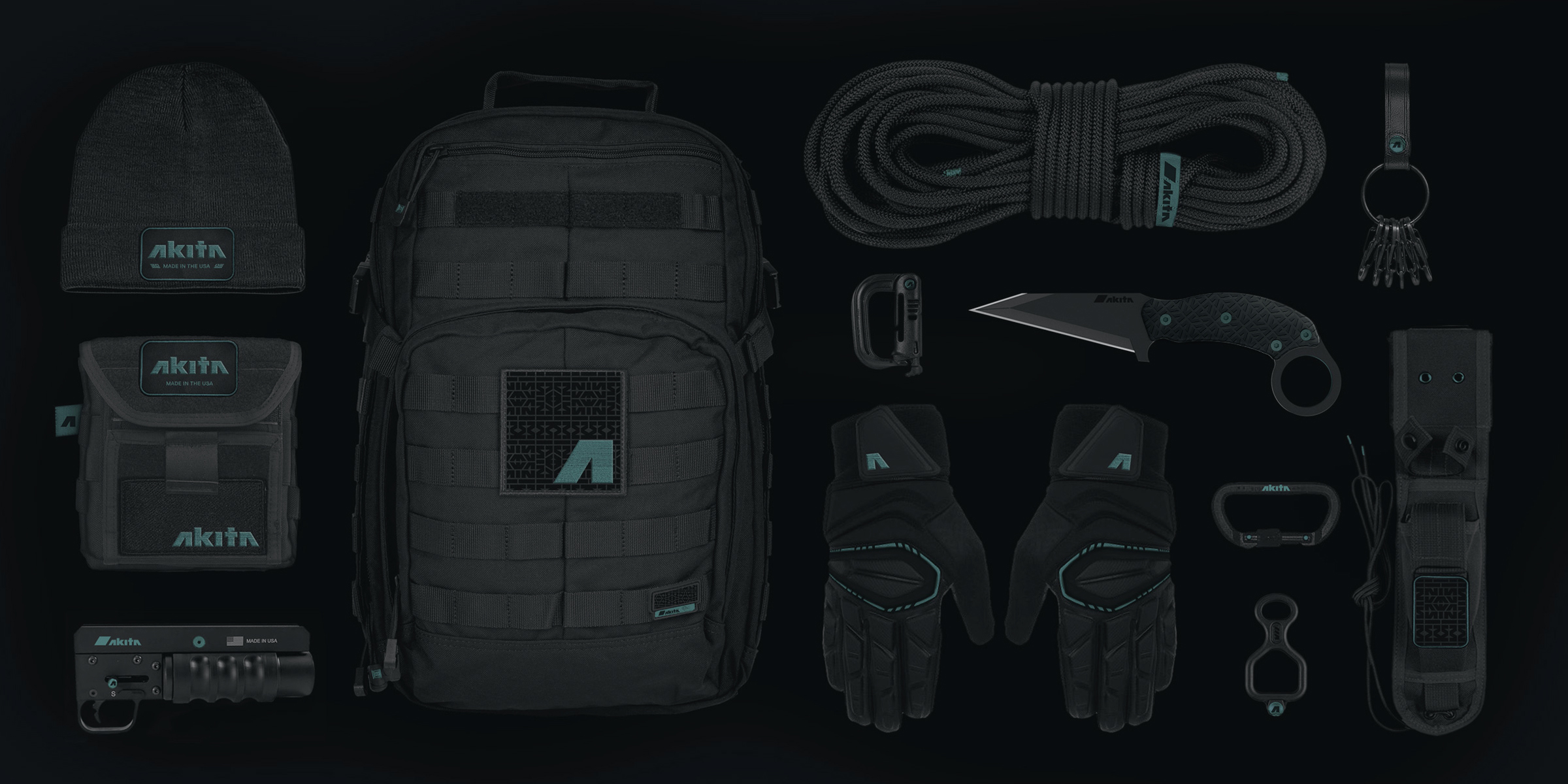
Akita (秋田犬) is a tactical knife company based in the Pacific Northwest. They specialize in premium hand-to-hand combat knives and tactical accessories.
Airlift Team
2016
Identity – Print+Digital – Art Direction

Akita (秋田犬) is a tactical knife company based in the Pacific Northwest. They specialize in premium hand-to-hand combat knives and tactical accessories.
Airlift Team
2016
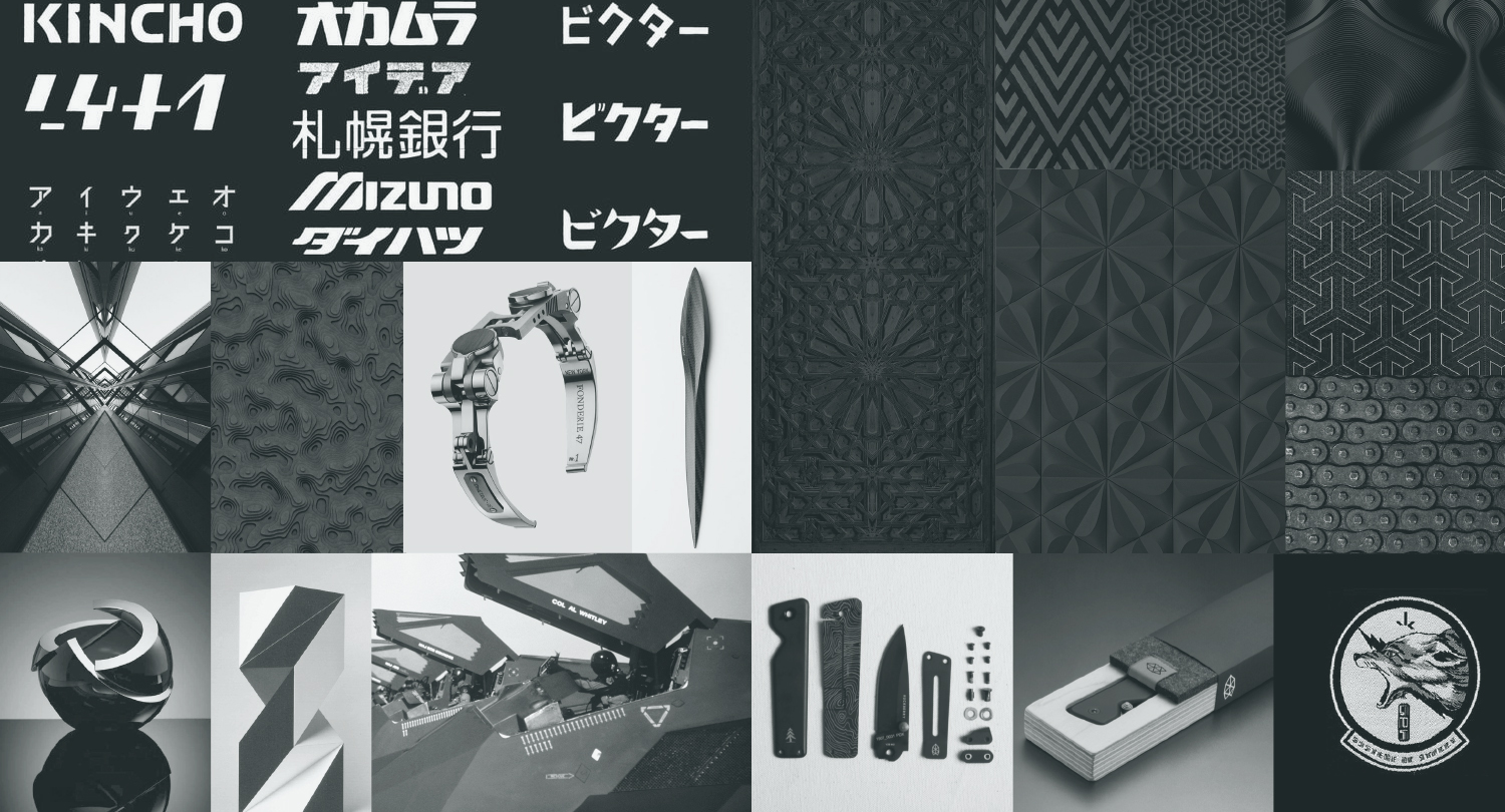 Mood Imagery
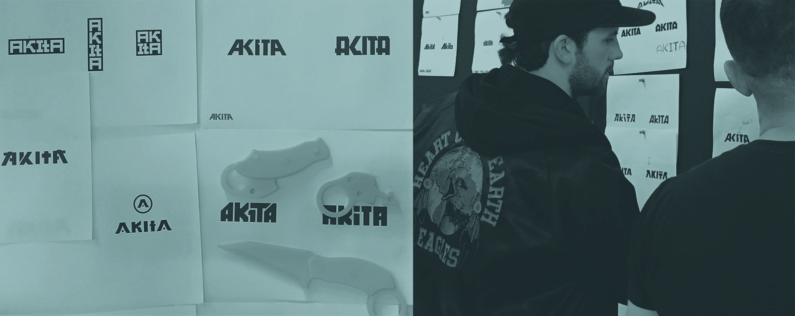

Discovery
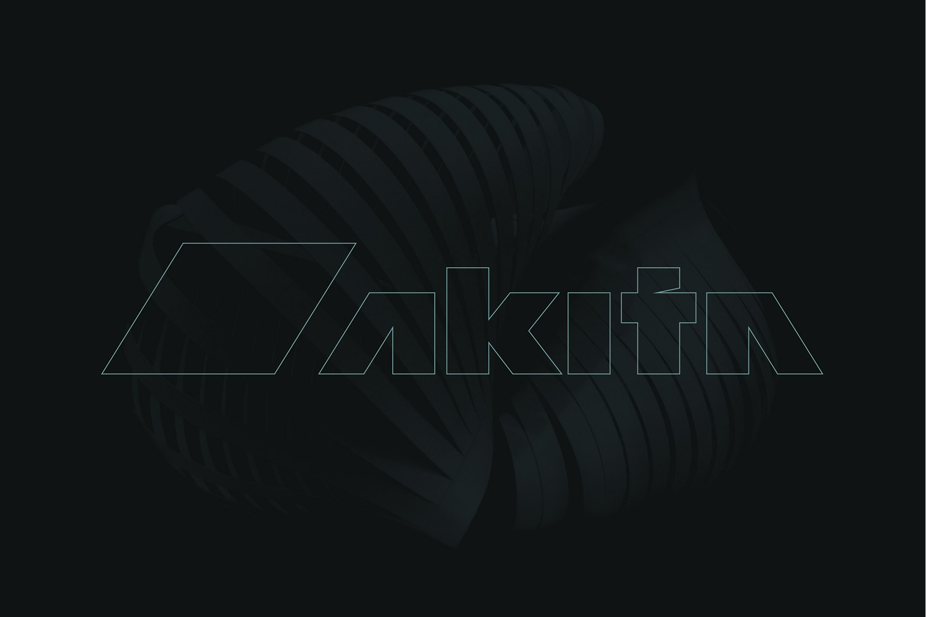
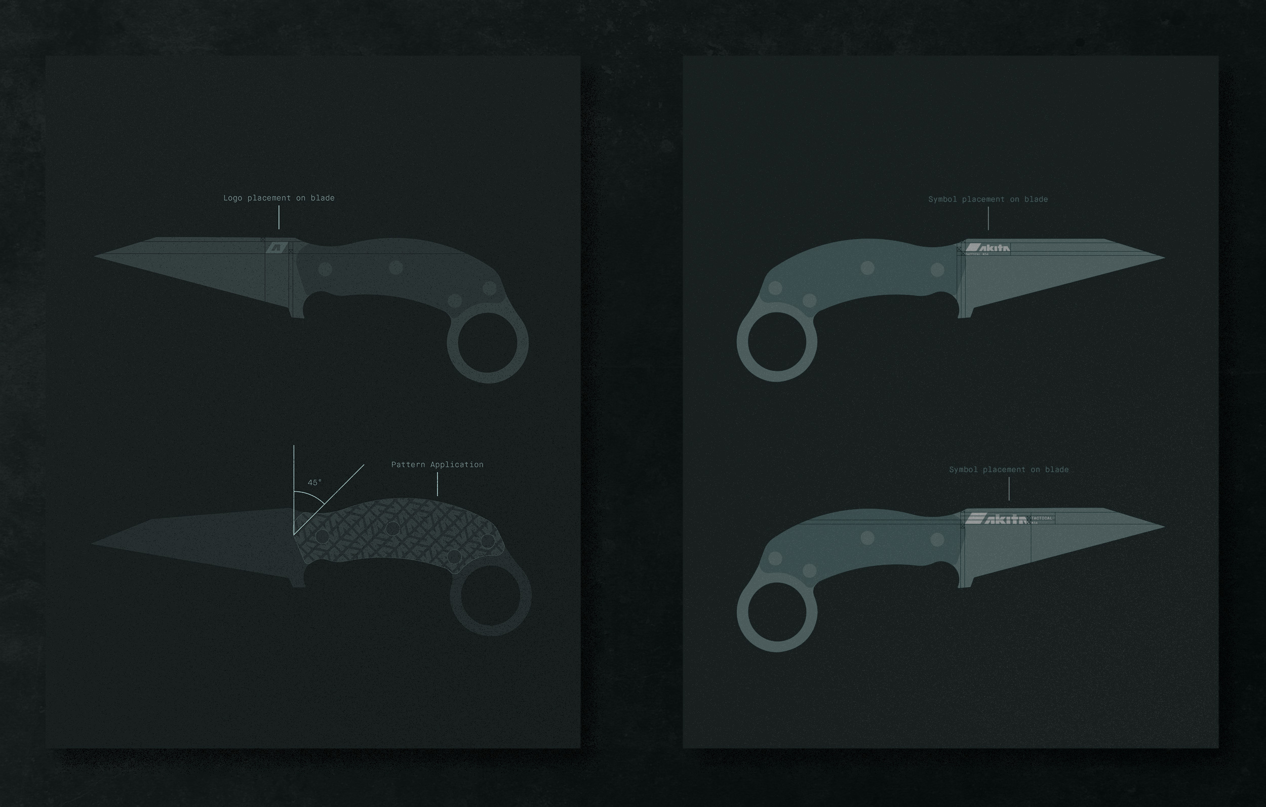
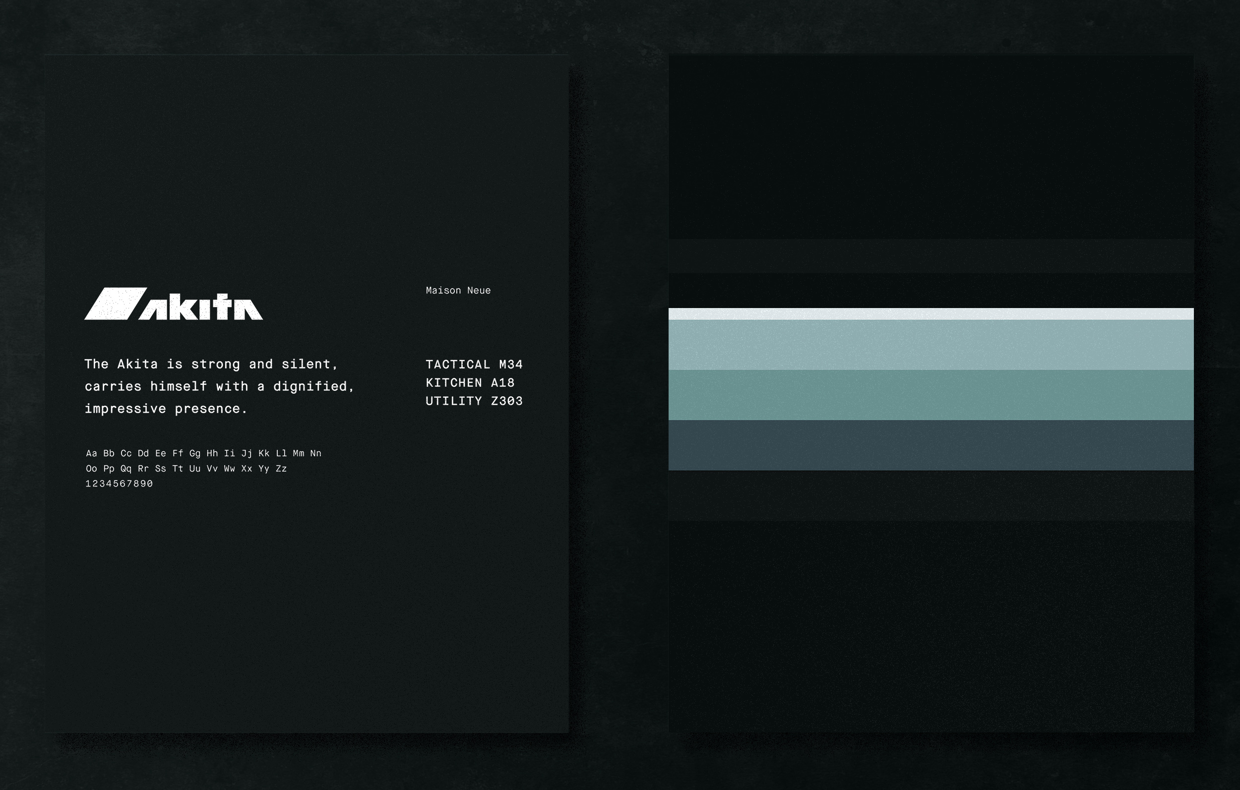
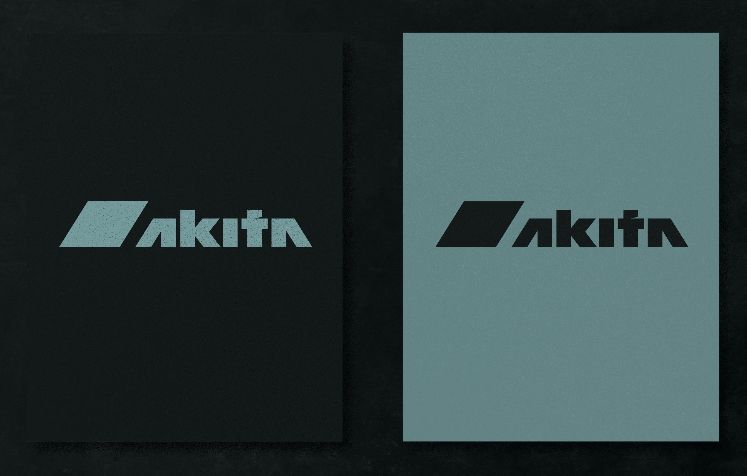
The strength and durability of Akita’s knives helped inform the visual identity. The mark is made up of angular geometry with sharp contours that feel militaristic and utilitarian in style. The logotype is further influenced by the aesthetic found in characters of the katakana alphabet to merge the Japanese origins of the Akita breed with the aesthetic of the company.
The strength and durability of Akita’s knives helped inform the visual identity. The mark is made up of angular geometry with sharp contours that feel militaristic and utilitarian in style. The logotype is further influenced by the aesthetic found in characters of the katakana alphabet to merge the Japanese origins of the Akita breed with the aesthetic of the company.







Team Credit — Airlift
I worked on Akita at Airlift, where we created brand, logo, colorway and the identity system. Creative Collaboration with Patrick Corrigan, Kevin Carr, and Peter Synak made this project possible.